


We're going to say something which is going to both shock and amaze you. Brace yourselves. It seems that on the entire internet, which is supposedly the greatest collection of human knowledge in the history of mankind, there's not a single website collecting together the programme genre icons from editions of the TV Times in the 1970s.
We'll wait a minute for that to sink in.
We've tried four different search terms in Google (including both the 'TVTimes' and 'TV Times' spellings of the publication in question), and nothing. It's time someone fixed the internet. And that someone is us. Just on the other side of a comically unexciting advert from 1976. If there's ever a UK version of Mad Men, it won't quite be the same, we fancy:

"Jennings! I'm taking you off the Cumberland Pencil People account! That was rubbish!"
[Editors note: The BrokenTV gang would like to point out that, although this wasn't the original intent, reading out the titles of the following entries in the voice of Brian Butterfield will improve your enjoyment immensely. That is all.]
10. Generic Movie

Ah, Hollywood: studio lighting, strips of film spewing out all over the shop, and a clapperboard. Does the job perfectly well, although a more literal interpretation of "Lights! Cameras! Action!" would have been welcome. "Lights! A strip of film rolling off somewhere! Action!" isn't quite the same, as surely they'd want to get that film back into the can first.
9. Deity-Based Programming
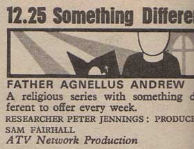
A faceless vicar reading from a bible next to beams of light shining through stained-glass windows. He doesn't even look annoyed that our scanner has cut off part of his picture. This does raise a question about just why, in this pre-VHS age, the series' on religion were often stuffed out of the way in a post-midnight slot (as indeed, this programme was). Surely all good God-fearing folk would be safely tucked up in bed by that hour, with only heathens still lazing about watching television at such an unholy hour? Maybe they were trying to convert them back?
8. News
 And now on ATV, News At Ten. Read by Morph and Chas. And a massive film can. (With the sport read by the nailbrush that thinks it's a dog.)
7. Programming Based On This Being Someone's Life

There wasn't a lot of use for this icon when Eamonn had put his book away for the summer, was there? It certainly does the job, though. The red (well, grey) book! Victorian photographs! Love, weddings and, erm, tiny tricycles. Perhaps the couple in the icon should have waited until they had a child before buying that.
6 It's A Showbiz Spectacular!

Glitter coming out of the set, there. This could be a bit better, in all honesty. The stars representing, well, 'stars' in the showbusiness sense. The shilouetted figures representing the fact that the show has some people in it? At least have one of them striking an impressively entertaining pose, for Bruce's sake! For all we know, this programme is a discussion on astronomy. That said, what a line up - Bob Hope (well, clearly, as it's a programme about him), Michael Caine, John Wayne, Bing Crosby, George Burns, and best of all, Lord Boob Monklouse. If it weren't for the fact we were about six months old when this show went out, we'd have bloody loved it.
5 Non-Pop Music

The icon for 'pop music' has a guitar in it. This is for 'classical' music, but we're not sure Instant Sunshine quite qualify on that score. It's entirely possible the icon was introduced during London Weekend's early months, just after their idea of introducing a bit more culture to the light channel's weekend schedule. Once that idea comprehensively died on it's arse, they were left with a spare icon, and had to cram it in wherever possible.
4 Spy-Based Movie

Crosshairs fixed on a man with a briefcase? Check. Man hiding around corner? Check. Gun? Check. Unspooled film running wild in background? Check. If you'd told us this was the Latvian poster for The Bourne Identity, we could well have believed you.
3 Agriculture-Based Recurring Drama

It has a programme icon, despite it only going out in the afternoons. Coronation Street doesn't even get an icon of it's own (at least in the two copies of TV Times we've got from this period), although this could be because there's a lot more scope for an interesting icon based on farm-themed programming. Bulls, cockerels, flowers, the rising sun and corn are the sort of thing the designer could toss off over a coffee break, whereas a grimy Northern city might not necessarily be as easy to express in felt-tip.
2 Hotel-Based Recurring Drama

Brilliantly, there's no pretence at making a proper effort here. It's as if Independent Television Publishers Limited's Icon Bloke needed to go home early one day. "Not until you've done an icon for our new soap opera, you're bloody not!" would roar the editor. "Hurrumph!" grumbled Icon Bloke, "what's it about, then?" Working from the limited brief ("a hotel, and don't mess this up, you're still on a final warning after your 'Showbiz Spectacular' icon"), this was chucked out with absolutely no regard for perspective. As to whether Icon Bloke would still have a job by the following week, well, he'd better have done something really special for his next piece of work.
1 Action Movie

And with this slice of majesty, Icon Bloke's job was secure once more. Planes! Exploding cars! And best of all, one faceless character walloping another one in the face! This is what we want, a minimalistic piece of work almost good enough for the portfolio of Saul Bass. We're not quite sure what the blob to the left of the plane is supposed to be (a badly drawn zeppelin?), but we don't care. This is the official winner of BrokenTV's Top Ten TVTimes Genre Icons Of The 1970s! In fact, all that's left to do now is to put up a picture from a terrifying childrens' programme.

8. News
7. Programming Based On This Being Someone's Life
There wasn't a lot of use for this icon when Eamonn had put his book away for the summer, was there? It certainly does the job, though. The red (well, grey) book! Victorian photographs! Love, weddings and, erm, tiny tricycles. Perhaps the couple in the icon should have waited until they had a child before buying that.
6 It's A Showbiz Spectacular!
Glitter coming out of the set, there. This could be a bit better, in all honesty. The stars representing, well, 'stars' in the showbusiness sense. The shilouetted figures representing the fact that the show has some people in it? At least have one of them striking an impressively entertaining pose, for Bruce's sake! For all we know, this programme is a discussion on astronomy. That said, what a line up - Bob Hope (well, clearly, as it's a programme about him), Michael Caine, John Wayne, Bing Crosby, George Burns, and best of all, Lord Boob Monklouse. If it weren't for the fact we were about six months old when this show went out, we'd have bloody loved it.
5 Non-Pop Music
The icon for 'pop music' has a guitar in it. This is for 'classical' music, but we're not sure Instant Sunshine quite qualify on that score. It's entirely possible the icon was introduced during London Weekend's early months, just after their idea of introducing a bit more culture to the light channel's weekend schedule. Once that idea comprehensively died on it's arse, they were left with a spare icon, and had to cram it in wherever possible.
4 Spy-Based Movie
Crosshairs fixed on a man with a briefcase? Check. Man hiding around corner? Check. Gun? Check. Unspooled film running wild in background? Check. If you'd told us this was the Latvian poster for The Bourne Identity, we could well have believed you.
3 Agriculture-Based Recurring Drama
It has a programme icon, despite it only going out in the afternoons. Coronation Street doesn't even get an icon of it's own (at least in the two copies of TV Times we've got from this period), although this could be because there's a lot more scope for an interesting icon based on farm-themed programming. Bulls, cockerels, flowers, the rising sun and corn are the sort of thing the designer could toss off over a coffee break, whereas a grimy Northern city might not necessarily be as easy to express in felt-tip.
2 Hotel-Based Recurring Drama
Brilliantly, there's no pretence at making a proper effort here. It's as if Independent Television Publishers Limited's Icon Bloke needed to go home early one day. "Not until you've done an icon for our new soap opera, you're bloody not!" would roar the editor. "Hurrumph!" grumbled Icon Bloke, "what's it about, then?" Working from the limited brief ("a hotel, and don't mess this up, you're still on a final warning after your 'Showbiz Spectacular' icon"), this was chucked out with absolutely no regard for perspective. As to whether Icon Bloke would still have a job by the following week, well, he'd better have done something really special for his next piece of work.
1 Action Movie
And with this slice of majesty, Icon Bloke's job was secure once more. Planes! Exploding cars! And best of all, one faceless character walloping another one in the face! This is what we want, a minimalistic piece of work almost good enough for the portfolio of Saul Bass. We're not quite sure what the blob to the left of the plane is supposed to be (a badly drawn zeppelin?), but we don't care. This is the official winner of BrokenTV's Top Ten TVTimes Genre Icons Of The 1970s! In fact, all that's left to do now is to put up a picture from a terrifying childrens' programme.
"Argh! Argh! Argh! Argh! Quick, put BBC-1 on! Oh no, the testcard! Aieee!"


9 .:
If I were asked to stake my life on it (is that the sort of thing that's likely to happen?) I'd say that the blob on the left is an F-86 Sabre. The snub nose, swept wings and bulgy canopy are all present and correct.
Exactly why a graphic artist in 1976 associated a Korean War-era jet with the ouvre of Burt Reynolds is more of a mystery.
I also really like the bloke on the far right. "TELL ME HOW NICE MY CUFFLINKS ARE, YOU BASTARD!"
Hang about... is that an action movie? But where is the floaty piece of film? This could be a programme about action, not a movie at all. Are you trying to trick me?
Ah but you don't know the half of it.
The "icons" (Billings stock blocks) originated with "Radio Times" in the 1930s. Originally they were individually commissioned pieces of art to illustrate specific programmes, but over the years some got used again and again.
After the war, when "Radio Times" split into seven regional editions there was a problem with making the billings fit - if the London Home Service had a two hour concert of an evening and the N.Ireland Home Service had six half hour programmes, then there would be quite a space disparity. This was often solved by filling the space with graphic blocks - 'fit to fill' if you like.
Now since Associated-Rediffusion's original "TV Times" was perforce a "Radio Times" clone, and since it cost money to commission, take, process and print actual photographs, it was a heck of a lot easier to sling in stock blocks. As other ITV regions came on stream with their own programme guides ("TV Guide" for STV, "Television Weekly" for TWW, "The Viewer" for Tyne Tees, "Look Westward" etc etc) they ALL did the same thing. Different artwork for each magazine of course, but they all had "showbiz", "classical", "news" blocks.
The ones you reproduce (from the later all-UK "TV Times" created in 1968) look like the early to mid 70s, and of course there WAS a "Coronation Street" block. And by this time, with a "TV Times" for each ITV region except Channel, the blocks' purpose became the same as the original "Radio Times" one - to ensure each region's page had no white spaces.
TONY CURRIE
Author, "The Radio Times Story"
Come on, Tony. After that, the world is waiting for the ITV Listings Magazine Story. You have one firm sale here already.
At least two firm sales, I'd say. All seems remarkably obvious, now I've been told. I'm slightly tempted to go back to the copies of TVT in order to look out for the tell-tale regional variations. For the record, the two issues scanned date from 28.8.76 (Cilla and Frankie Howerd cover) and 27.5.78 (Scotland's doomed stab at the World Cup cover).
Tony (if you're still about in commentland) - is it okay if I quote your comment on the blog 'proper'? With due credit given, natch.
Louis - I approached Sly Bailey at IPC years ago for permission to do a "TV Times Story" and she wasn't remotely interested. Couldn't do it without permission to reproduce covers, pages etc, so the project failed, alas. Now working on something slightly different....
Feel free, Mark, to do whatever you like with my posting!!
TC
Splendid, thanks Tony.
Yet another reason to dislike Sly Bailey.
The original Bongo in Animal Kwackers was Geoff 'Rockschool' Nicholls, by the way.
Post a Comment